Tenerio
Services
Live site
https://www.tenerio.skThe challenge: One out of many
The client faced tough decisions when starting their company focused on digital loyalty cards - they had nothing to make them stand out from the crowd of tough competition. They needed to find something unique that would differentiate them from the competitors' grey SaaS sites.
Loyalty to tribe
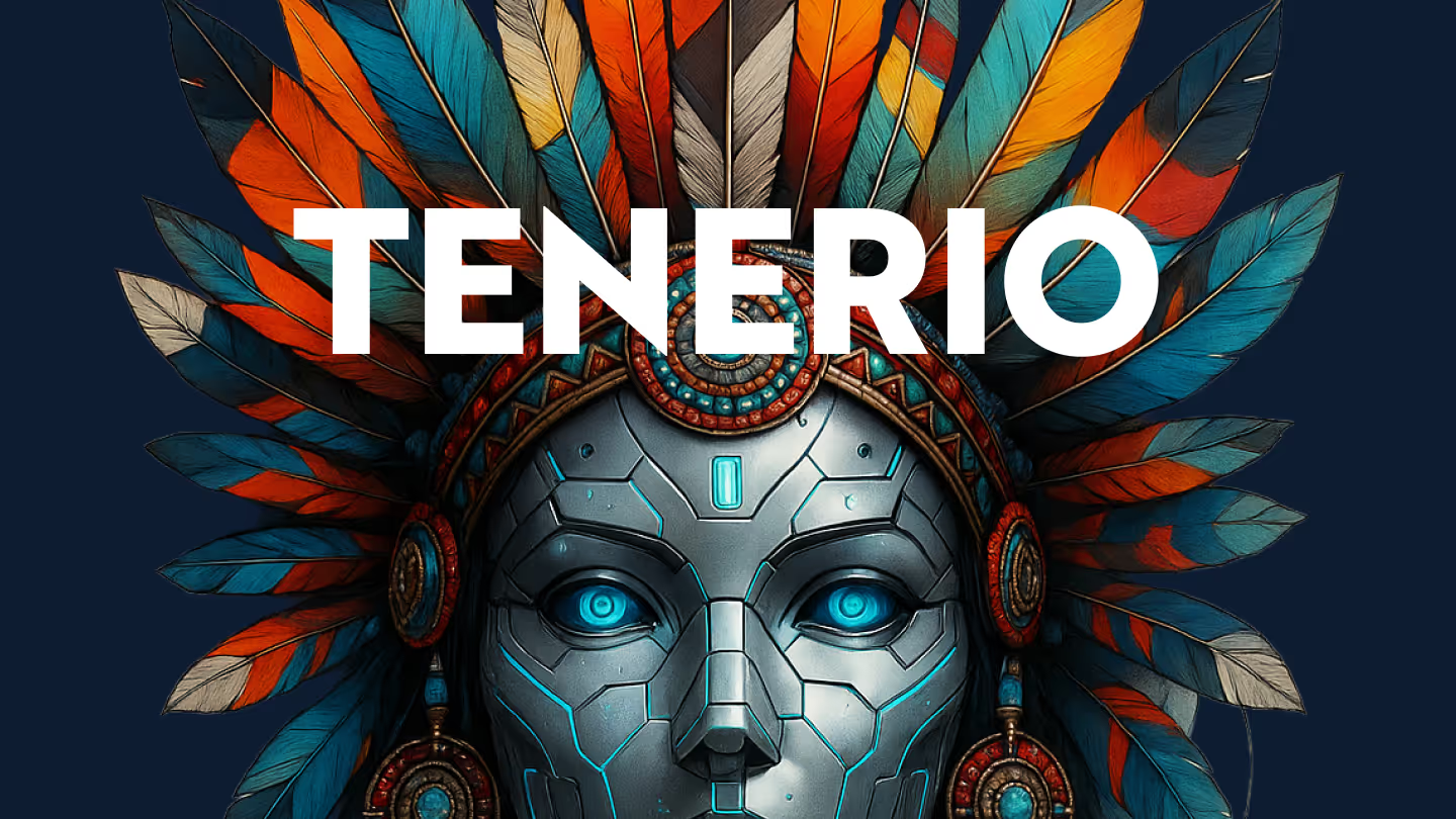
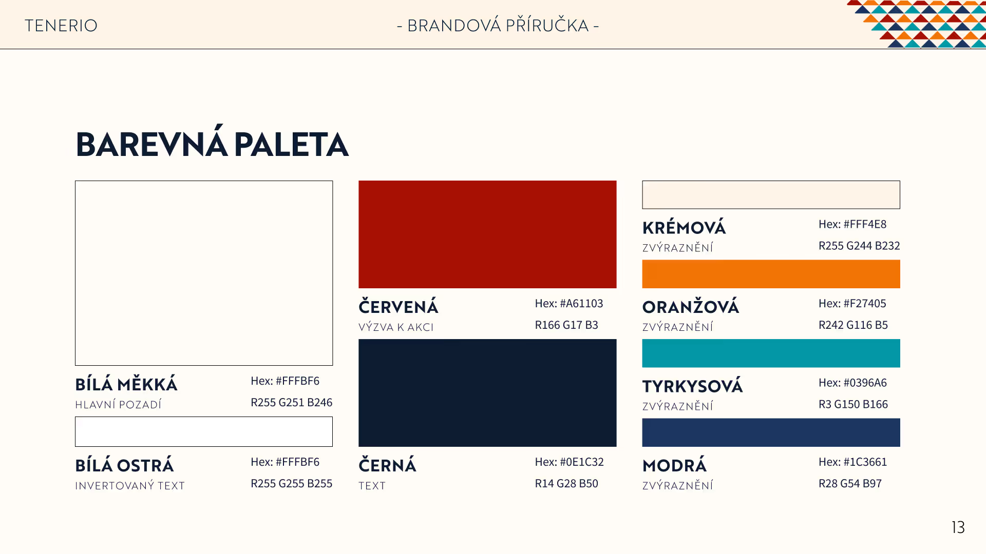
We delved deep into strategy sessions and decided to differentiate the brand visually - most competitors show boring grey SaaS websites. To counter this, I created the "Tribe" as the metaphor for customer loyalty and crafted a bright, vivid, friendly visual identity with tribal colors and symbolism.
Vivid stands out
Where competitors offer soulless grey products, Tenerio shines with its colors and patterns. This makes the brand more personal to customers and easily separates Tenerio from the crowd.
Strategic brand identity
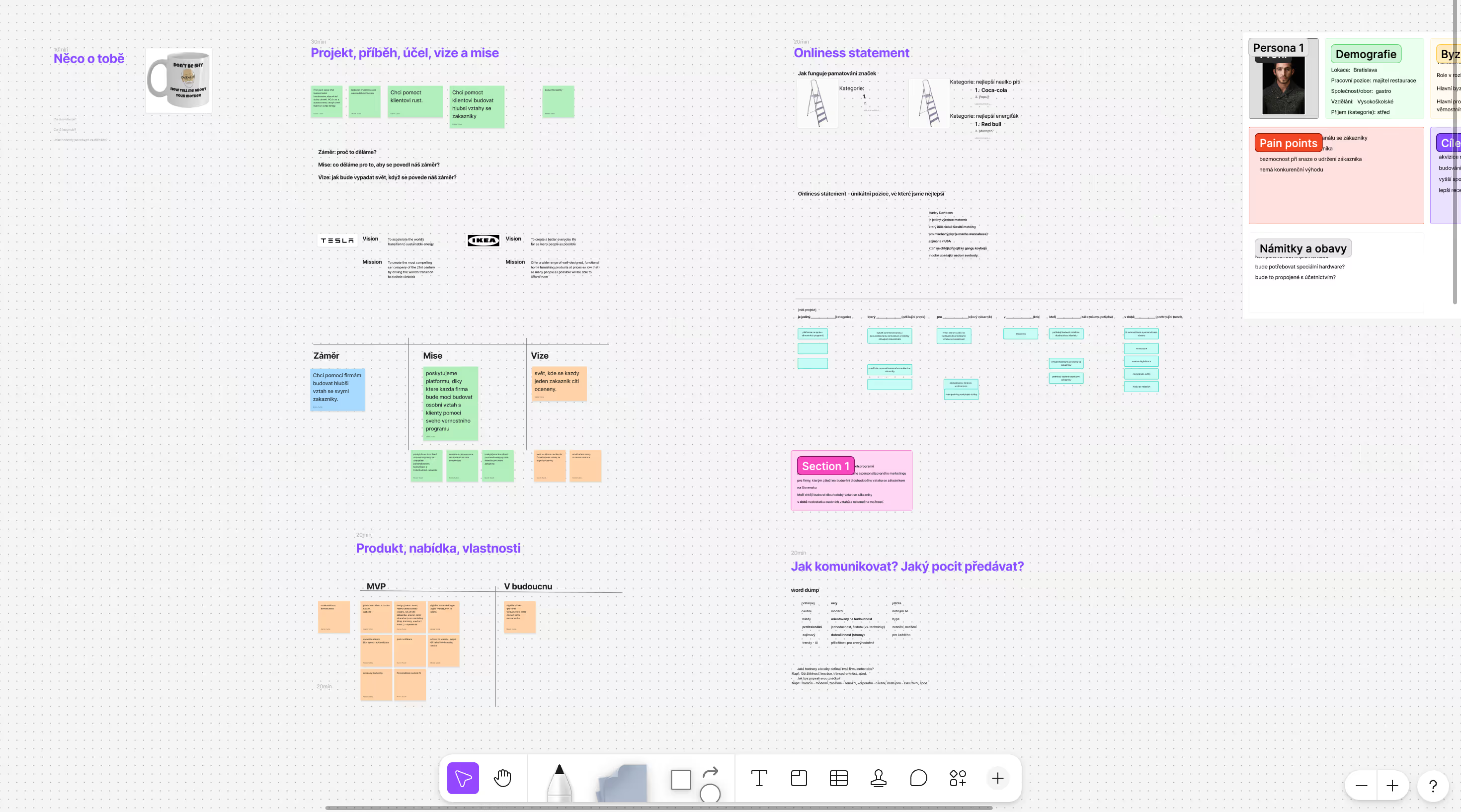
I guided the client through extensive brand strategy workshop - there we explored, what Tenerio is, its place in the competitive landscape and strategies to develop the brand.
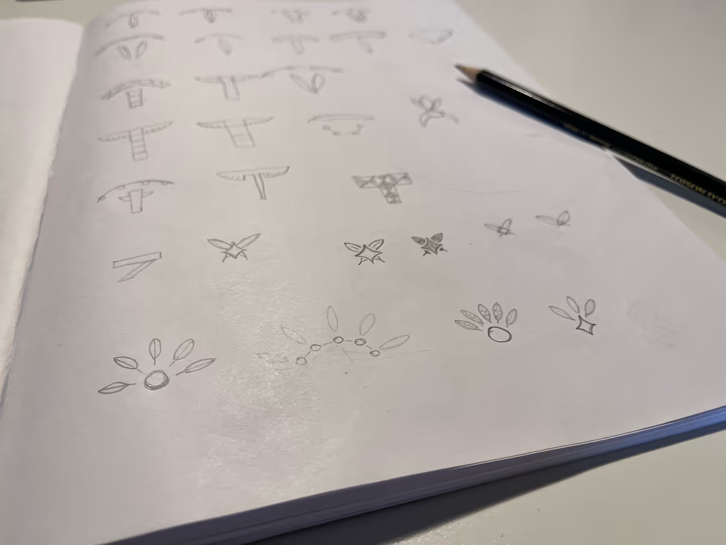
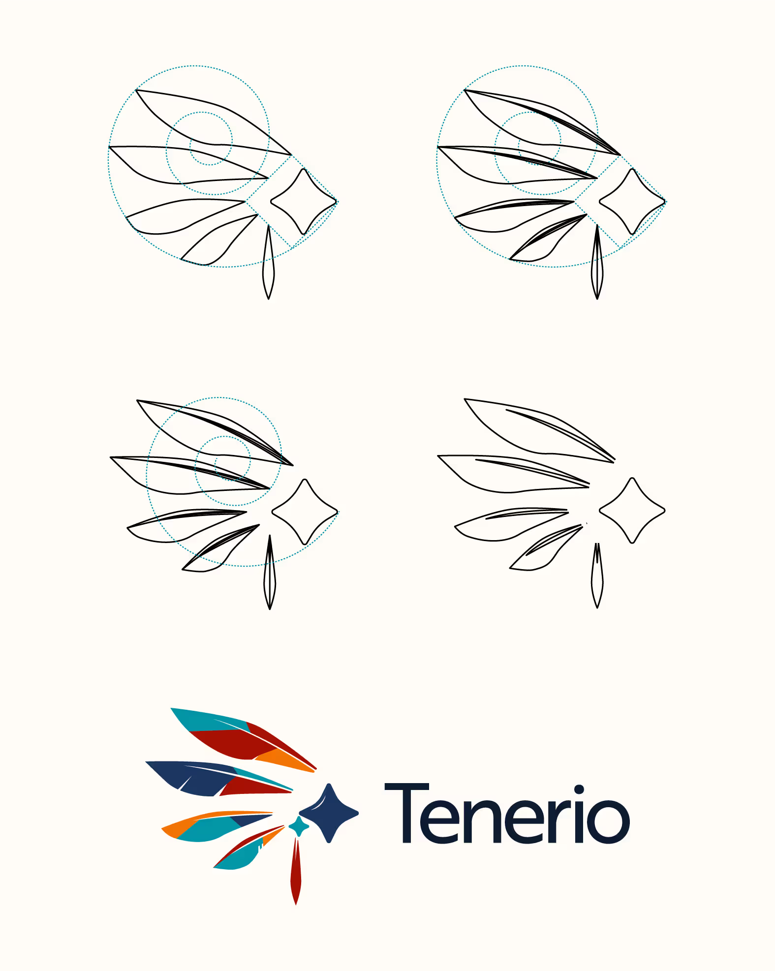
Logo concepts exploration
We agreed to differentiate the brand by its looks and feel - therefore we chose the "Tribe" metaphor for loyalty, bright colors and tribal shapes.
The website
Let's talk about your project now!
I am currently accepting new partnerships for Q1 2026.
Tell me about your goals, and let's see if we are a good fit.